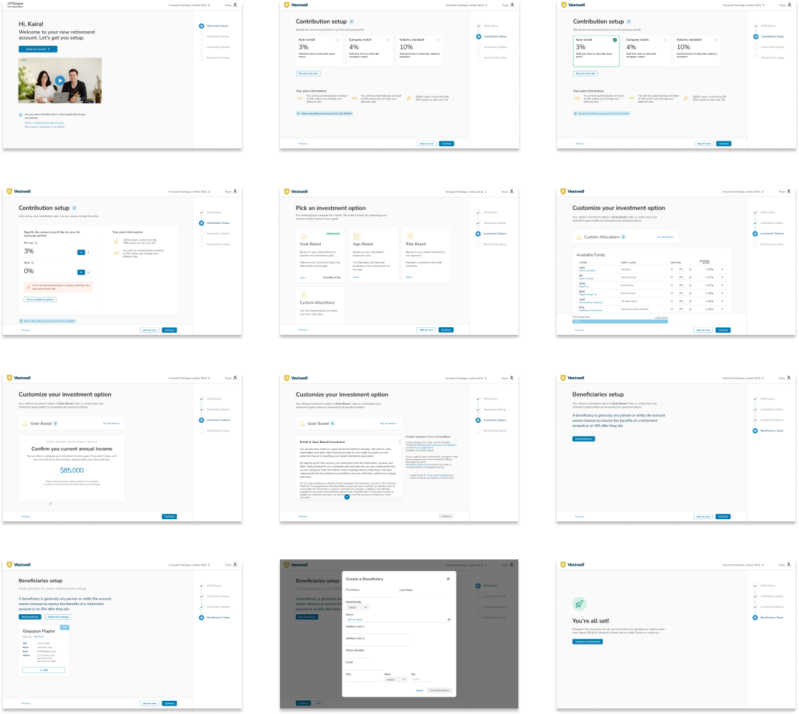
- Role
- UX Designer, UX Researcher
- Tools
- Figma, Hotjar, UsabilityHub
- Timeline
- 4 Months

Discovery
Background
Vestwell empowers workplaces with its digital recordkeeping platform, providing more flexibility to manage retirement plans for advisors, employers, and employees. I worked across different projects and managers to design and deliver internal and client-facing experiences for the platform.
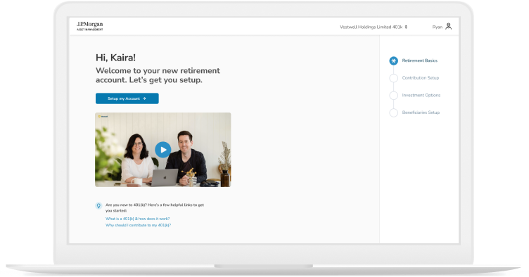
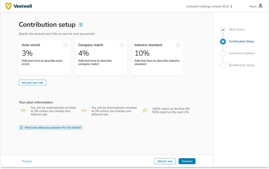
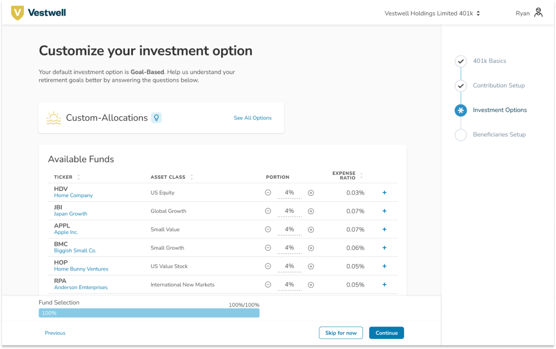
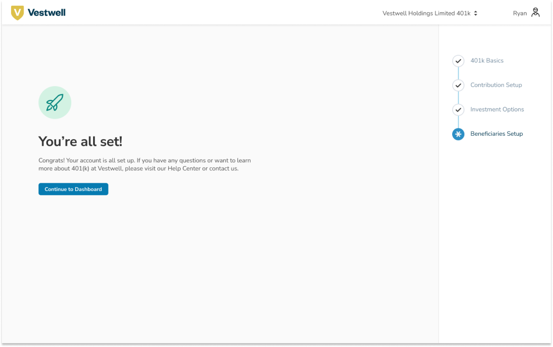
One of the client-facing projects I had the opportunity to design is Vestwell's onboarding experience. My role for this project is a user experience designer and researcher focusing on making the platform more informative, relative, and welcoming for new users.
Problem Statements
- Stakeholders automatically enrolled in retirement plans via their employees need a proper introduction to the platform
- Relevant information from the stakeholder that would help with their retirement plan is left blank until the stakeholder chooses to input it, such as household income or beneficiaries
- Stakeholders receive an email stating they enrolled in a retirement plan but nothing more, which creates a passive interaction
- Stakeholders with a light understanding of retirement are left in the dark to figure out the financial jargon directly on the platform
- There are no entry-point for new users to understand how the retirement platform works.
Goals
- Increase retirement knowledge for new users to navigate the platform confidently
- Immediately receive and store relevant retirement information about the user before the user accesses the application, such as annual income, beneficiaries, and investment options
- Reduce confusion and inquiries by providing a step-by-step process that allows users to see what makes up their retirement plan
- Set a standard for user engagement instead of dropping them off on the platform by providing information on what the application can do for them and what they can do on the application.
Literature Research
- Onboarding slides help users feel welcome
- If done well, onboarding can establish further trust between the user and the product

Define
User Journey Mapping

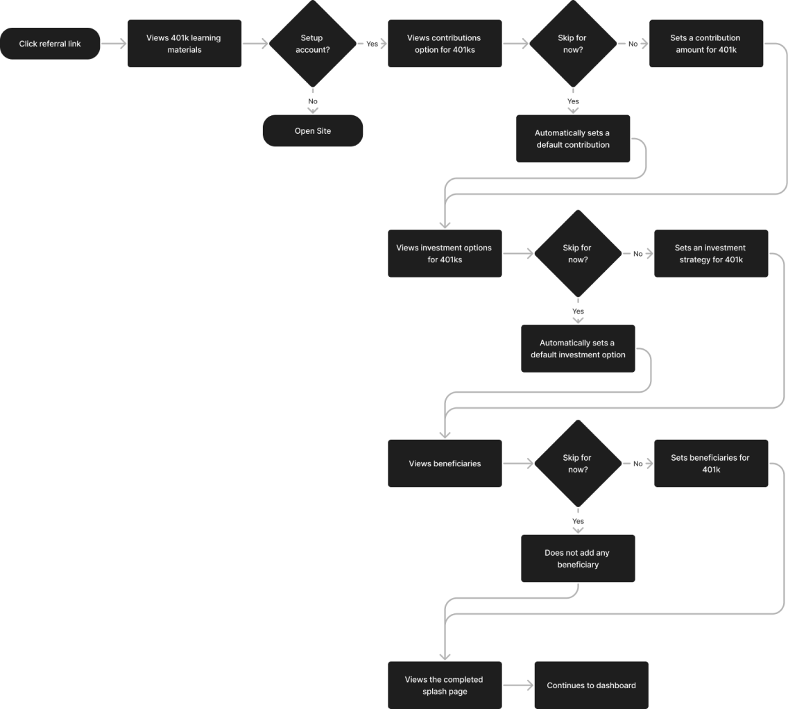
User Flow
The user flow operates from the tasks retrieved from the user journey map that targets the user recently enrolled on a 401k through their employer.

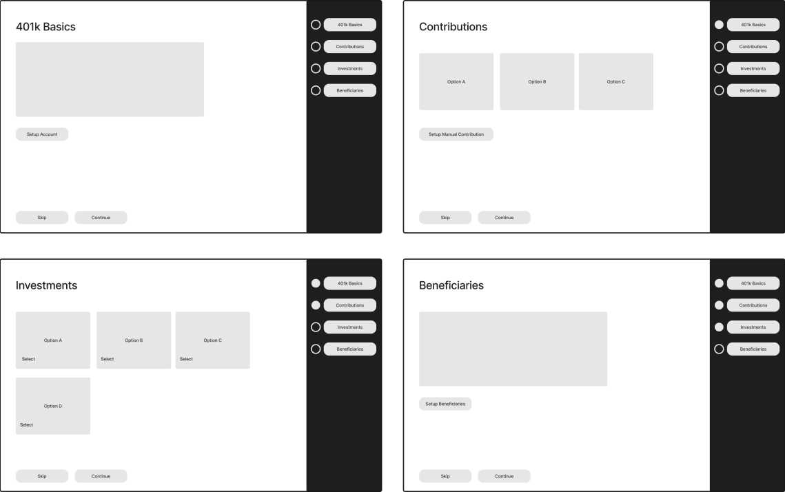
Sketches
With this user flow in mind, we started picturing beyond the MVP through wireframing as much as possible. The challenge here was considering the existing mobile prototype, translating it to a desktop, and considering our insights from the usability test. We sketched several ideas for different pages of the eventual prototype. These are just a few preliminary sketches that we did.

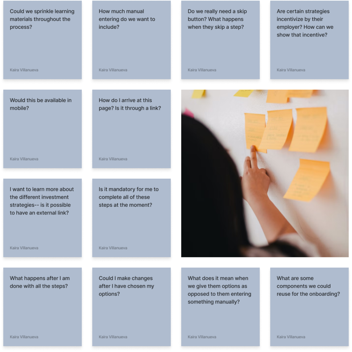
Participatory Design
By including product managers, engineers, and potential users at this point in the design process, we aim to uncover more pain points to deliver user-centric onboarding for our platform at a reasonable time. For a week, we sought our stakeholders' decision-making and creative processes. It aims to ensure that the final design reflects the needs, preferences, and values of the people who will ultimately use or be affected by the designed product, service, or system.
