- Role
- UX Designer, UI Designer, UX Researcher
- Tools
- Figma, Mixpanel
- Timeline
- 6 Months

Discovery
Background
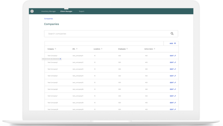
Kinetic has an existing inventory manager that organizes its hardware devices, often used to assign a device to a user. The project included redesigning their inventory management system, an internal tool for operations engineers to assign, unassign, create, delete, or update devices.
The inventory manager consists of two sections: client manager and direct inventory. The Client manager lists the active and deployed devices based on companies, which could be further broken down into locations and employees. The immediate inventory consists of items that still need to be shipped.
Research Goals
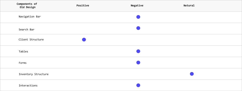
- What components of the old design are helpful to keep, and which ones should be removed?
- What do operations engineers look for when managing these devices?
Interviews
We started conducting interviews within our internal team. We interviewed operation engineers and a few customer engineers. There were complaints about the old design. Most of them hacked their way through the interface and gave me a list of these hacks they used to accomplish tasks such as assigning or finding devices. The main takeaway is that the structure works, but the interface needs revision.

Define
Sketches
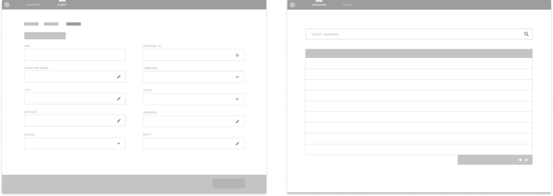
There are two main types of views—a list view with a table and a detail view with a form. Since users approved of the larger structure, the prototype focused more on revising the detailed views. We prototyped different types of sketches and came up with a consolidated version that would be used for the final type. The sketches were also tested with the operation and customer engineers.

User Flow
Since there are two sections, there are two main flows—one for the client and the other for inventory. Under the client flow, there are three main sections, company, locations, and employees. The company contains locations and employees. The locations include the employees. There is an edit page for each company, site, and employee. On the inventory side, there are connected and unconnected devices. A connected device could be editable.

Design
Final Design
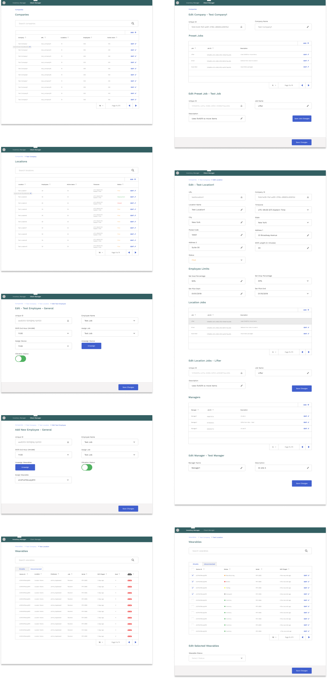
For the final design, there are a total of 9 pages, which consists of the company list, company edit, location list, location edit, employee list, employee edit, employee add, then connected and unconnected devices.
