- Role
- UX Designer, UI Designer, UX Researcher
- Tools
- Figma, Hotjar, Otter, UserTesting
- Timeline
- 8 Months

Discovery
Background
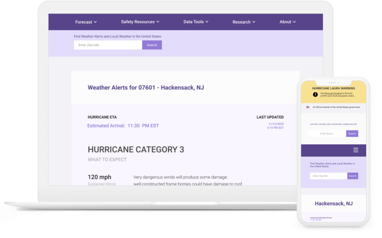
While working on my thesis, my advisor, Professor Robert Soden (http://robertsoden.io/) recruited me as a researcher where I collaborated with a team of sociologists, product designers, and computer scientists between Columbia University, University of Washington: Seattle, and University of Colorado: Boulder to assess a website redesign for the National Hurricane Center.
As a result, we presented 18 design opportunities to the National Hurricane Center, and one of the opportunities they picked is designing for user localization, which is the focus of my thesis, “Exploring User Localization as a Design Opportunity through Human-Centered Design Principles for the National Hurricane Center Home Page (NHC.NOAA.GOV).”
Research Goals
- In a state of emergency during a hurricane, how do we provide users information relevant to their situation?
- Which information is important to display in order for them to make the best decision that would ethically suit their needs?
- What do users look for when assessing the risk of a hurricane?
Interviews
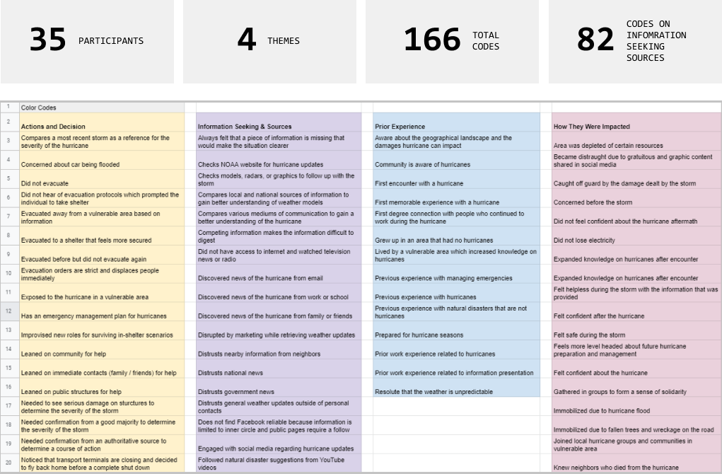
35 interviews were conducted remotely through Zoom. There are three categories of questions that we used: demographics, past experiences with disasters, and post concerns. We interviewed participants across the United States that were in locations susceptible to hurricane disasters. The initial part of the process focuses on the demographics and background, mostly asking how long they have lived in their current residency, or if they have any prior training related to disasters or severe weather.
These questions generally assess for experience and familiarity of users to hurricanes which would help in constructing the display of the home page. The next set of questions aimed at how they were able to retrieve hurricane information, and the actions that they have taken based on the lack of or known information. 4 themes were generated from the inteviews, and 166 codes were collected. Afterwards, the theme I focused on is information seeking and sources.


Competitor Analysis
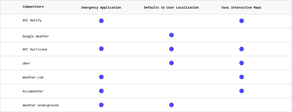
After all of the code reviews, 18 opportunities were presented to the National Hurricane Center. They provided their feedback and mentioned that they would like to see a design for user localization. From that point on, the first thing I did is conducted a competitor analysis to check how other applications are utilizing user localization on their home pages. Patterns started appearing, such as defaulting to user localization where the application would directly show the results without asking or a search input bar that asks for a zip code. Over 60 applications were audited for user localization.
Weather.com is interesting because this acts as two-fold: automatic and manual geolocation. The automatic geolocation is used on the front page, and since Weather.com relies on ads, they could take advantage of the automated geolocation to cater to a specific audience. The NHC could use this same technique, and on the front-page, it could automate the geolocation and check if the area has any upcoming hurricanes or alerts. Websites that sell products are often given the option to pick up an item via store, and the stores listed are based on proximity to the user’s location (retrieved via geolocation).
Define
User Personas
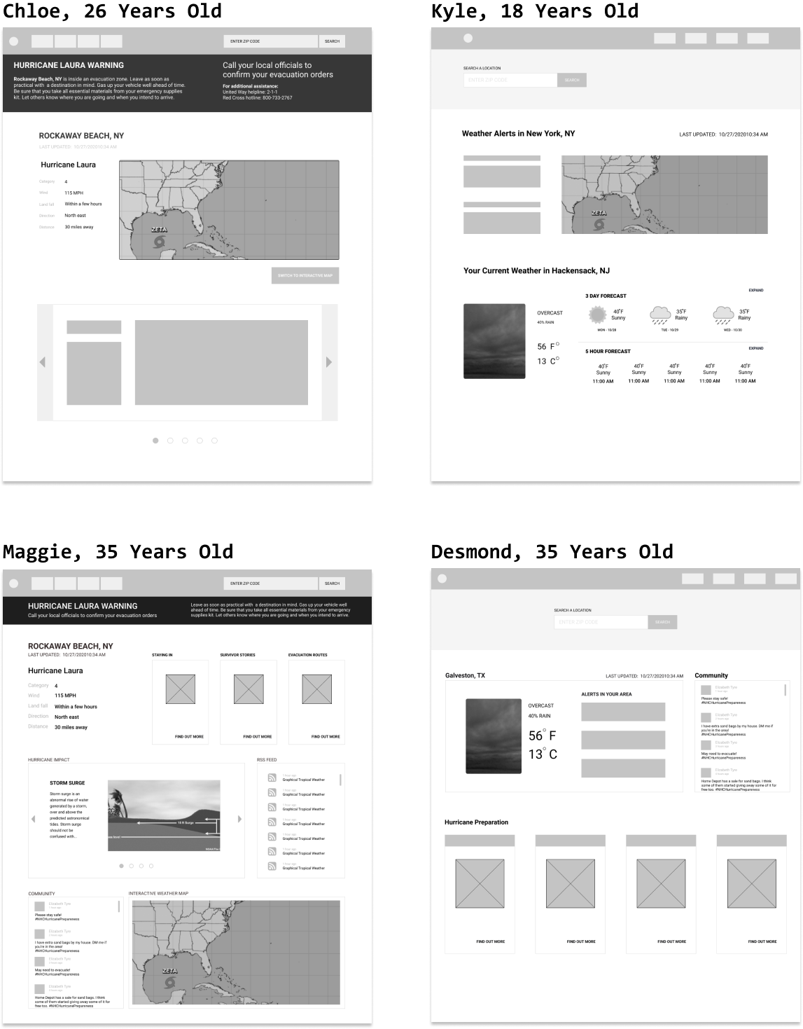
From the interviews, four user personas were created that reflects the codes pulled from the theme of “information seeking sources.” Sketches were created based on these four personas as well but for the user testing, one user persona was picked which is Chloe’s persona because the participants that were interviewed mainly reflects her character.

Sketches
After all the research I have conducted, I started building low fidelity sketches on Figma for each persona. Not all personas share the same secondary needs, so I consolidated their primary needs into a final user interface. I combined the components that overlap for all personas, and removed the components that include social media because even though this was requested, the client also does not currently support this feature.
I also made component sketches that I further refined for the user persona sketches. They mainly consist of components relevant to hurricane risk information, such as a main search bar, interactive maps, notification sign-ups, and more. Some of the components did not make the cut because they were not as pertinent to the user persona. Those sketches can be viewed here.

User Flow
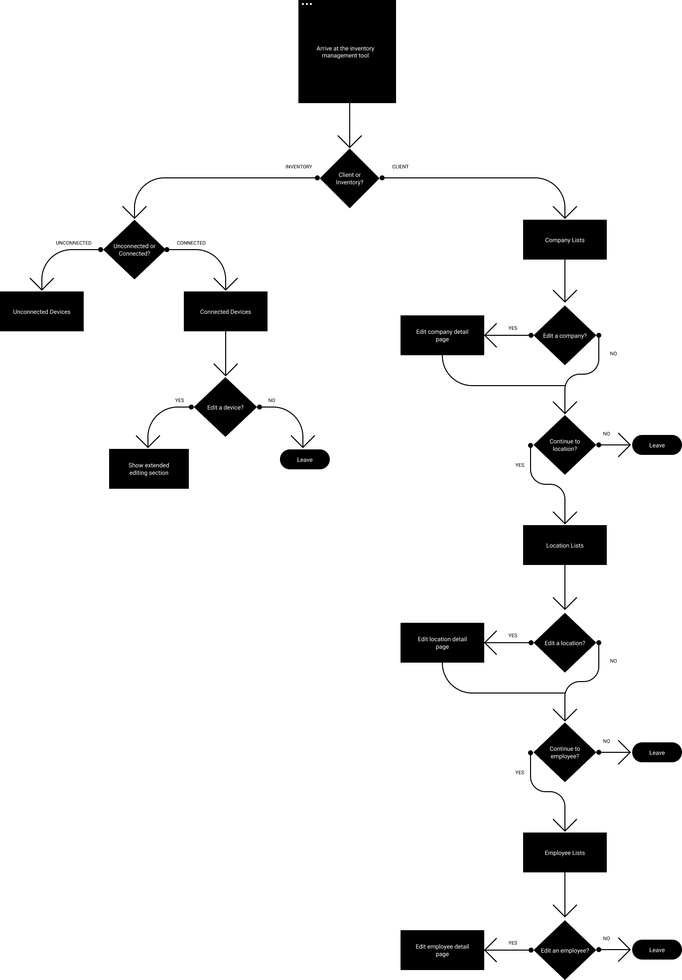
Since the focus is strictly on the home page, the user flow is limited to traversing the website based on whether the user needs hurricane or weather information. If the user is in a vulnerable area, the hurricane information immediately displays, otherwise that information will not be as available but the weather will be.

Design
Final Design
The final design was tested with needs similar to the persona of Chloe. Most of the response from the final design consisted of adding social media which was present in the initial rough draft. I think that would be helpful in seeing how nearby users via social media are interacting with the storm.


